Several projects can share the same <project>.graphics.nsh file use it to create multiple installers with the same design.
|
File <project>.graphics.nsh
|
Header file containing all necessary settings required for correct working of Graphical Installer powered installer. It is an addition to file called <project>.nsi which is a main installer file.
![]() Tip:
Tip:
Several projects can share the same <project>.graphics.nsh
file use it to create multiple installers with the same design.
All Graphical Installer powered installers MUST contain both
files (also they must be in the same directory). If this or
<project>.nsi is
missing, the installer will not be skinned properly!
Use these symbol to set design of the resulting installer:
These identifiers define the rough design of your installer:
This identifier is generated automatically and it is used to
recognize <project>.nsi file and
<project>.graphics.nsh.
Do not edit or delete it!
If this symbol is deleted (or commented out) the installer
design switches from 'skinned' to 'classical' look!
Defines icon for installer (and uninstaller). Icons must have the same size (or the same count, if you use multiple icons).
If this symbol is defined the Cancel button is hidden (invisible - cannot be clicked) on all installer's pages.
If this symbol is defined the Back button is hidden (invisible - cannot be clicked) on all installer's pages.
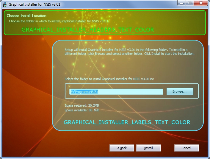
Specification of all text colors in installer (Texts shown in all pages of installer and in main window):
![]() Tip:
Tip:
Graphical Installer uses single format for all colors and symbols
in script. This format is the same as HTML format:
0xRRGGBB where
- RR is Red part of color (00 - FF)
- GG is Green part of color (00 - FF)
- BB is Blue part of color (00 FF)
Color of all labels in installer. Labels are all static texts in installer window except the headers.
Color of all header texts in installer. Headers are usually at the top of each page in installer.

Image shown at the background of main window and all installer's pages:
![]() Tip: How to create background image
for NSIS?
Tip: How to create background image
for NSIS?
See this technical section how to properly
create background images for NSIS.
Image shown at the background of every page of installer.
Required format: .bmp .jpg or
.gif file, with dimensions exactly 690 (width) x
496 (height) pixels
Image shown at the inner dialogs page of installer.
Required format: .bmp .jpg or
.gif file, with dimensions exactly 450 (width) x
228 (height) pixels
This image is generated via BitmapCutter.exe tool
automatically from Graphical Installer Wizard.
Image shown at the inner dialogs page of installer when RTL
flag is set.
Required format: .bmp .jpg or
.gif file, with dimensions exactly 450 (width) x
228 (height) pixels
This image is generated via BitmapCutter.exe tool
automatically from Graphical Installer Wizard.
![]() Tip: When you are creating installer mixing
both RTL and LTR languages do not forget to create this RTL image
and define this symbol.
Tip: When you are creating installer mixing
both RTL and LTR languages do not forget to create this RTL image
and define this symbol.
When user select LTR/RTL language an appropriate image is
automatically shown. See Examples/RTL Languages Example for more
info.
Images for buttons and scrollbars used in installer:
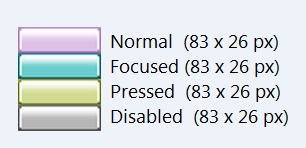
Picture for buttons in installer. Required format: Bitmap
(.bmp) file with 4 button states inside of it:
normal, focused pressed and disabled.

Size (of each state) is 83 (width) x 26 (height) pixels, together
83 x 104 pixels.
Button images should not have any text written on them. Text is
loaded dynamically from NSIS language file!
![]() Tip:
Tip:
Button is in "focused" state when user moves mouse
cursor over the control.
In earlier versions of Graphical Installer the "focused" state was
applied when user pressed the Tab key to select some control (the
control could be activated using Enter key).
To achieve this old behaviour disable the
GraphicalInstallerEnableButtonsHighlight macro as:
Function onGUIInit
# Set the installer to the old style of "focused" state (activated
with the Tab key)
${GraphicalInstallerEnableButtonsHighlight} 0
FunctionEnd
Mask picture - defines an area a of button which becomes
transparent. Using this mask it is possible to create irregular
buttons. The transparency color is taken from left-upper corner of
picture (coordinates 0,0).
Mask dimensions are the same as button state: 83x26 px.
Picture for skinning scrollbars in the installer. All controls that have scrollbars (Tree Views, Rich Edits, ...) will use this picture for skinning their's scrollbars.
Specification of buttons texts colors in different situations:
Color of all button texts in installer. This color is used for all buttons when they are in normal state.
Color of all button texts in installer. It is applied when a button has focus.
Color of all buttons texts in installer. It is applied to buttons when they are pressed down.
Color of all buttons texts in installer. It is applied to buttons when they are disabled.
Color of progress bar in Installation page and its background. Not using these symbols causes default Windows colors are used:
Foreground color of progress bar.
Background color of progress bar.
Example of colored progress bar:
License page specification. Adds possibility to print and save the license file (buttons):
If this symbol is defined, Print button is added to page
License; after its click License file is sent to default
printer.
It is good to use License page file for this symbol. If you wish to
use another file, do not forget to extract it into $TEMP
directory.
If this symbol is defined, Save button is added to page License;
after its click Save as dialog is shown and user can save License
file to his hard disk.
It is good to use License page file for this symbol. If you wish to
use another file, do not forget to extract it into $TEMP
directory.
If this symbol is defined the checkbox (or radiobutton) control's font for accepting the License terms is bold.
Picture shown when installer starts (optional):
Picture shown at installer start. It is a bitmap image (.bmp)
with arbitrary size. Recommended format is 24bit file, but this is
not necessary. Comment out this line if you do not wish to use
splash bitmap.
This picture can be transparent (it can has irregular form).
Specify the color you want to have transparent in your script file
(in function .onInit).
This symbol sets how long the picture defined with GRAPHICAL_INSTALLER_SPLASH_BITMAP will be shown. Time is in miliseconds.
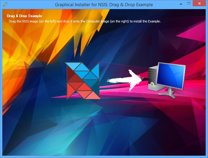
Prevents bots from installing the software (human interaction is required to continue in installation, similar to macOS .dmg installer, optional):

Picture shown at the left side ('Application' or 'Source'
picture). User must click this picture and drag it above the
Destination picture and drop (release the mouse) it there.
Recommended size is 128x128 pixels. This image must be saved in
32bit .png format (with transparency).
Picture shown at the right side ('Target' or 'Destination'
picture). When Source picture is dropped here the installer
advances to the next page.
Recommended size is 128x128 pixels. This image must be saved in
32bit .png format (with transparency).
This picture is optional and it can be skipped. However it may
be useful to show some information to user e.g. arrow (how to drag
and drop).
Recommended size is 128x128 pixels. This image must be saved in
32bit .png format (with transparency).
![]() Tip:
Tip:
You can define your own Show and Leave functions which are executed
for Drag & Drop page (optional):
!define GI_DRAGDROP_CUSTOMFUNCTION_SHOW DragDropShow
!define GI_DRAGDROP_CUSTOMFUNCTION_LEAVE DragDropLeave
Functions DragDropShow and DragDropLeave must be defined in the
main script file (.nsi).
This macro enables to drag the installer window with mouse (except the Inner Dialog area):
![]() Tip:
Tip:
Perfect place to call this macro is:
Function onGUIInit
# Enable (or disable = 0) moving (dragging with mouse) installer
window
${GraphicalInstallerEnableDragging} 1
FunctionEnd
This macro enables or disables drawing of the focus rectangles for Button, CheckBox and RadioButton controls. Default value is 0 (OFF). Focus rectangles are useful for keyboard navigation (focusing the controls with the Tab key) within installer and improve user experience.
![]() Tip:
Tip:
Perfect place to call this macro is:
Function onGUIInit
# Enable (or disable = 0) drawing the focus rectangles
${GraphicalInstallerDrawFocusRects} 1
FunctionEnd


Use the GRAPHICAL_INSTALLER_CUSTOM_UI symbol to
set the custom UI file for the installer - dialogs dimensions,
buttons positions, labels coordinates and much more.
The UI file (by default an .exe file) contains dialogs and whole
User Interface of a NSIS installer.
Use Resource Hacker (free tool) to modify the UI
file.
![]() Tip:
Tip:
See the Custom Dimensions example for more details
how to use this symbol.